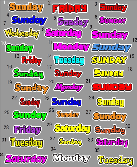
We had a quite a lively discussion about fonts for the Days of the Week the other week.
Gaz has been hard at work finding alternatives. But which one do you like the best?

If we get an answer quick I’ll upload a special present for you!
P.S. the winner of January’s comment competition was Kobekid – well done! February’s competition is now on, so help choose your favourite font above and you might end up winning a Genki English CD!


Hi! I’d like numbers 1, 4, 34, 35 because they are the easiest to read for pupils from 4, 5. 5, 7 years old and the first letter is in capital letter so they are not going to make mistakes when they write it in their notebooks.
And in the future, Is it posible to write ordinals numbers? ( first 1st, second 2nd…) because I teach ordinals numbers in order to say the date in English, because in Spanish we say the date with cardinal numbers ( one 1, two 2, three 3…).
Thank you for your time and fantastic materials.
LINES
number 7 is the best of all
Number 25 and number 27 are the best. They are easy to read and if you look at the letter a it is written how a student should write the lowercase a in the English language. It also has a capital letter to begin and all lowercase after. Correct English again!
My favourite one is the number 19. It’s clear, attractive, and appealing.
5,22,35would be my votes.
In general all those with capital letter in the front and small ones after that are okay and easy to read.
Personally I find 1 and 4 a bit too simple, should still be fancy and attracting.
I like number 13 most since it looks a little bit “naughty” and so suits for the kids.
My first ever comment on Genki English – WhooHoo!!!
I really like 35, except for the “typewriter a”.
Therefore, my vote goes to 4 or 25 because they’re easy to read, only the first letter is capitalized, and of course, they don’t use the “typewriter a”.
By the way, did you notice that there are two 34’s?
Sanuk! (that’s Thai for “genki”)
I don’t have a strong preference, but I suggest avoiding using all capital letters (so not 2, 6, 15, 18, or 21). And not anything hard to read or sort of hard to read (not 7, 8, 11, 13, 23, 26, 29, 33, or the first 34). I have no problem with interesting fonts, as long as they are easy to read. And I think thinner fonts are easier to read. #35 is the easiest to read for me, a native English reader, but it is still not a boring font, so I vote for #35.
I’m pretty sure that students will love 25, because it can be read easily, I mean the size is the perfect one.
I´d like number 19
Wow, I thought I’m the first one to open it. Well better late than never.
Here is my entry:
(9) (34) There’s a aying Simple is the best.
Oh my gosh I won! The CD of my choice and a case a beer right?
What Martin said, gotta be 25.
This isalsomy first comment to Genki English. I assume that youngsters will enjoy No. 5 and 28 because they are usually attracted to the colour and letters are nicely designed so they are easy for them to read.
I agree with those who don’t want capitalized words.
I also agree that a ‘handwriting style’ a is *probably* better, which unfortunately would rule out 35, which would otherwise have been my choice.
17, 25 or 27 look OK to me.
….but I could still be persuaded to go for 35…..
Hello to everyone! I like ## 1,34 as they are plain & easy to read. I like # 12 as it reminds some stereetlights & may be useful to the students too:)
I do think that we should keep it easy readable for young students:)
9 or 34.
Most visible from furthur away I think.
Hello,
I would prefer to be able to use number 34.
It’s much simpler, clearer and the children can also colour it in, either with a colour they choose or as part of a lesson for beginners who are learning about colours.
Personally, I lke #35 the best. It is clear and easy to read. But I have to agree with Georgeanna. # 25 and 27 are the best for the kids. The a is written the way they lern it in school.
Thanks Gaz for all the alternatives!!
Hello everyone!
I vote 34
It’s very clear and easy to read.
I you want to use all capitals then I vote for 15.
Thanks for letting us prticipate!
Bonjour,
Les polices que je préfère sont les 35 et 34.
les autres sont plus funs mais moins faciles à lire pour les élèves.
Merci pour votre site !
Cordialement.
Hi, I love n° 34. I would like to make a comment regarding Genkienglish. It’s really a GREAT method which I apply in teaching young children in Switzerland. I teach since several months and the children show soooo much interest in learning. Thank you also for all these nice ideas you bring through your web site.
Viviane
Hello
Ilike number 25 because my daughter likes it
I like them all but the most favourite for me were 1 , 20 & 22 .They look familiar to pupils.
I would choose Number 34 (saturday- i like it because it has a clear “a” which is the way my students are used to writing it ), 13 and 30 are easy to read and also not so neat exactly like a kid’s handwriting.
I like n° 35 a lot !
I prefer no 7 it’s like the letters are dancing, I think this match rather well with your songs.
I like 15, 34 and 35, though this last one might prove difficult to read for some kids (i’ve used similar font in some exercises and some kids find it really difficult). The only ones I’d definitely avoid are 2, 7 and 21.
Hi,
I think 13 is nice because it is legible and at the same time a bit kidlike and 34 is great because it is clearly visible and legible also from further away. But I think I would go with 13.
Thanks for including us in the decision, that is really cool!
Absolutely I choose no. 13. It’s so cute and the size is perfect, not too small nor too big.
I quite like number 35, it’s clear and fun.
I like the fonts without the typewriter {a}. 16, and 32. Those two also look more like hand printing to me.
I liked 7 too because of the “dancing” but the {N} is capitalized… and there’s that dang typewriter {a} again.
Number 15 is the best!!!!
i like no. 35. i think itțs the easiest for children to read
I like number 7 it’s simple and fun 😀
Hello,
My class voted for number 7 and 34. I can see that we all have different tastes. Happy selection!
My favourite ones are 25 and 27, I think they’re the easiest ones for little kids.
I like 35, 25 and 13. Is it harder to choose now that everybody has an opinion ???
I think that number 28 is great. The letters are clearly defined with the black outline and therefore it is easy to read.
Hope you’ll choose that one. 😉
I vote for 15
I like 27! easy to read for kids.
hello, No 34 is so plain and ordinary so I pick this font, it is easy to read.
I’m probably too late, but here are my comments. I think the main problem with the first calendar was that it was too “busy”. There are a lot of letters on one line and with them all being in capitals, looked even more so.
I would choose a font that was simple, not too wide and had a strong black outline so as to better distinguish the letters. for example 13,22, and 35
Numbers 25 and 27 are the best. They begin with a capital letter and the letter “a” is the way children write the letter.
I wish the song began with Sunday because when we say the days of the week, or sing the song, we always begin with Sunday, rather than Monday as in other countries.
I like nearly all of then…some of them are very clear so that’s nice and helpful with children,some of them are very funny and sparkly which means they are very much lively for children (and for me,of course)…I love number 16….It’s sweet and a bit sassy…just like kids…but 7 and 35 are very nice either.
Lots of kisses everybody
Mabel
20, 28 or 35. Easy to read.
I vote 34!
I love #7 but being a grade one home teacher, #34 is the best for early writers, and readers. Thanks for all your hard work Richard!
Barbara
I prefer number 15. I think it’s nice and clear and not easily confused.
I like numbers 27 and 6. 6 is good for the little ones because it’s easy to read and 27 is good because it doesn’t have the computer lower case a. It has the “a” that we usually write.
Hi Richard, I realy think the most voted was number 34.
I would like this number in order my pupils colour it in the first week of the month.
I always ask for the date, season and weather in my classes. The oldest write it on the board ( every day a different child), but the smalest ones don’t know how to write so the first activity could be colour today day ( your days). children love it and all children are waiting for their colouring day.
And as teachers we also are teaching the cultural and artistic competence (LOE)our Spanish educational law and European Union.
And maybe at the end of the first week of each month, the calendar could be as nice as genki calendar, ¿ Don’t you think
Thanks a lot.
I’ll go with 26 or 28
26 is clear and relaxing.
28 has the 3D feeling, and it looks far from the vision.
My favorites are 20, 25 and 27. They are easy to read for kids and the letters are clear.
Lines, great idea about coloring in the days of the week!. Richard do you think you could make two versions, one with the Days in color and the other in black and white?
I posted this in the wrong place, so here it is again,
I prefer font number 32, 2nd pick 16 and 3rd pick would be 17. All of these choices are based on the fact the the ‘a’ is written as it should be, not as you see it here a. Also the first letters are capitals. Here in Japan I find many kids know the capital letters because they are used everywhere but they have a hard time with the lower case letters. In Oz many calendars start with Monday, Sorry I don’t want to get all religious on everyone but God rested on the 7 day, Sunday. Having Sat and Sun together is good. But here in Japan the first day of the week is Sunday.
Cheers, thanks for always letting us air or views.
Terry
HI
I likes number 28 best
HI
I like number 28 best
27 works best…. Because it’s font is clear and readable…. The more funky you try your font, more difficult it is for students to grasp, coz’ specially the younger kids have just learnt their ABC’s .. So, It would be difficult for them if the font is too funky…
I’ll go for 25 and 27 for my fourth grade students.
I love 1, 9, 34 and 35 except the “typewriter a” for my fifth and sixt graders.