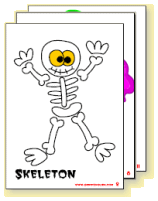
Here are the latest versions of the Trick or Treat song pictures, all done up as A4 pdfs! The black background looks best, but I’ve also done a white background version for when you have an ink budget to think about.
Changes can still be made if necessary so please leave comments and I hope there are no mistakes as I am really tired after a hard weekend in India! zzzzz
Owners Club
Bonus Materials…
A4 Flashcards
(What’s this?)

(White background)


These are really neat, I’ll test drive them in class tomorrow. Think that the zombie might be a bit too scary for young kids though. I’ll let you know.
I LOVE THEM!!! THey are really super! Thanks
@Rosebud: Only the first 8 are in the “cute” version, so zombie isn’t included. But let’s see how we go!
These are amazing picture cards!! I will also test drive this song in class tomorrow and check if they love it more than the Halloween song!!
Perfect. I am so pleased you read my mind Richard!! I was hoping you would do a card for the first word and then one for both! Black background, white background! Mini cards are coming soon too! Wow!! Thanks so much, Halloween will be great.
Yes, these are excellent. Thanks!
Especially pleased with the choice of background. The black does look cool, but uses an awful lot of ink. It’s not just the budget we should think about – it’s also rather “mottainai”. So, thanks again.
Hi Julian,
Interested point about the “mottainai” (which sort of means “a waste”). This is something we’re always having with India: Where do we draw the line?
To play devil’s advocate for a moment:
Is it mottainai if we use picture cards at all? Why not just draw them on the wall? If the kids learnt more quickly with gold plated ink why not do that? If having a computer for every child makes them learn quickly why don’t they all have them? Or are things like lights and desks mottainai?
It’s all very interesting the choices we make!
Well, there is certainly a huge difference between sloshing excessive amounts of unnecessary ink around and denying the kids basic furniture needs!
Surely you must have noticed the disparity between facilities and materials in Japan and India. Do you reckon that the kids in that school (in Hokkaido?) you went to with the huge state of the art touch screen technology will come out of their English lessons and into the real world with a firmer grasp of English and more confident enthusiasm than the kids in those ill-equipped Indian rural schools?